If you’re building a developer platform or SaaS product…you’ve likely heard of the term average user. And if you’re wondering why product adoption keeps stalling despite solid features, that “average user” might be exactly the problem.
The stereotypical profile that describes who most of your users are, often plastered on a marketing powerpoint as “John, Age 21, loves dogs and coding in the afternoons.”
And while optimizing for this average user sounds like a smart call because you believe you’re tapping into who most of your developers are… it’s quietly going to sabotage your product adoption.
Why?
The average user doesn’t exist. It’s a statistical ghost created by averaging everything in data, and the result is building your product around someone who doesn’t strongly like or dislike anything.
And if your target market is someone who basically believes in nothing then well…you’ll end up with a product that excites no one.
The comfort trap that kills product adoption
Let’s try to understand the dangers of designing for the average even more.
Most teams build personas by averaging survey responses and usage data. The result is a fictional character who never struggles, never tests limits, and never actually breaks anything.
Designing for that persona produces polite products.
They feel safe because nothing seems wrong with them and are fine for demos because users report it as just okay, but they’re not going to stand out and build a loyal user base in the real world.
In fact, nearly every successful product in tech had been impolite.
They focused on users with radically different beliefs, and turned their product into a platform that supported their values.
In fact, we’ve analyzed SaaS companies that crossed $100M in ARR, and NONE of them had achieved product-market fit by optimizing for average use cases. They all had their breakthrough when focusing on very specific, radical use cases in the developer experience.
Take Slack, for example.
They didn’t win by making chat simply better for the average office worker. They obsessively designed for teams dealing with async communication, unreliable connections, and complex workflows.
That focus forced them to build threaded conversations, offline mode, and clear navigation, and it clicked with remote teams, driving their early growth.
And this principle doesn’t just apply to product features. It applies to everything around the user experience.
Take your documentation, for example. If you design it for the “average” developer: someone who has average skills and average knowledge…you end up with vague guides that frustrate beginners and leave experienced users guessing.
But when you design for someone who has never touched an API before, you’re forced to explain every concept clearly, show complete code examples, and spell out handling every error.
Suddenly, even your most experienced developers move faster because they no longer have to fill in the gaps.
How Nintendo Wii won by designing for non-gamers
Nintendo is a great example of avoiding the average user experience.
Sony and Microsoft were already designing consoles for hardcore gamers, pushing better graphics, more processing power, and complex controllers.
The average gamer was believed to be the young, intense player in the basement, juggling eight combos on a controller until 3AM.
But instead of designing for that image of an average user, Nintendo asked: What about people who actively disliked traditional controllers?
What about casual players? Parents? Hell even grandparents, after all, why shouldn’t they play too?
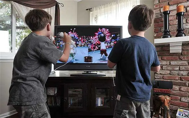
The result was the motion-sensitive Wii controller, a radical departure that made gaming intuitive for non-gamers. It became special because it made gameplay simple and shared.

Families, friends, people who had never touched a video game could instantly understand that swinging that controller meant hitting a home run (or breaking the tv screen if they forgot to wear the straps).
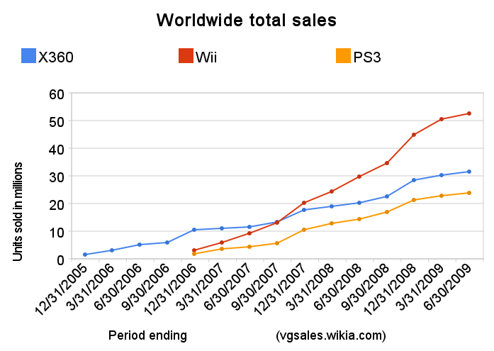
And the payoff was massive: in 2007, the Wii outsold both PlayStation 3 and Xbox 360 combined, expanding the gaming market instead of just competing within it.
If Nintendo had designed for their idea of the average gamer, they would have ended up with a watered-down PlayStation or Xbox, something most players would have called unremarkable, and the gaming market left underdeveloped.
Finding the right extremes to drive product adoption
For many teams it might seem a bit uncomfortable seeing users who don’t follow that definition of what average looks like in the market.
If you were on Nintendo’s team in the 2000s, you’d probably have fallen out of your chair when you heard you were catering to people who had never played a single game, while trying to compete as one of the biggest gaming companies in the world.
The thing is…those extreme, unusual users aren’t problems. They’re your best partners in shaping your product to stand out. The key is figuring out which extremes matter and designing around them.
At Stateshift, we call this Extreme User Design. It’s a method we use with developer tool companies to improve product adoption by flipping the typical persona approach on its head. It works in four steps.
Step 1: Identify meaningful extremes
You want to identify users who push your product to its limits, those working in unconventional ways, at unusual volumes, or with workflows you didn’t expect.
Examples include:
- First-time developers integrating payments
- Teams operating at 100x expected load
- Users relying on assistive technology
- Communities operating asynchronously across time zones
These users are often overlooked. They might be using workarounds to get things done, choosing substitutes to suit their needs, or are so new to the market that no one has really paid attention to them yet.
Step 2: Observe before you optimize
Before you rush into a burning building for these users, pause. Ask yourself: What makes them extreme? What pain points do they have? Why do they struggle? How do their behaviors apply to other users?
Observing and interviewing them is the only way to truly understand how to design a product that works for them, and, as a result, works better for everyone.
Examples of what you might see:
- For first time developers: You might observe them staring at an error message for minutes, unsure how to proceed.
- For high operational teams: Their team trying to run massive imports hitting rate limits or memory issues.
- For users using assistive technology: Seeing them experience low-bandwidth or older devices facing slow load times or broken UI elements.
- For asynchronous teams: Community members struggling to collaborate asynchronously because threads and notifications aren’t intuitive.
These observations create insights that average-user testing will never catch. They highlight potentially new use cases, hidden problems in your product, and unserved needs for developers in the market.
Step 3: Prototype for extremes first
Once you fully understand your users, it’s time to start designing solutions that fully solve the extreme case.
Don’t compromise. You want to make sure the experience works flawlessly for the user who pushes your product the hardest. It’s like armoring your product with plating because you know these users will tamper, twist, and throw it around unlike others.
Once that’s done, check how it can be adopted by everyone else. Most of the time, it does, it actually makes the experience simpler for other users too.
A great example is Stripe:
When they built their API, they didn’t just think about experienced developers, they focused on someone integrating payments for the very first time.
That constraint forced them to explain every concept clearly, show complete code examples, and spell out error handling in detail.
The result? Not only did focusing on first time users enable them to easily understand and integrate Stripe into their workflows, but experienced developers got a faster, smoother integration experience too, because they no longer had to guess or fill in gaps.
The great benefit of building around extreme users is that if a solution works for solving their painpoints, it’s usually bulletproof, intuitive, and can be surprisingly universal.
We’ve seen this play out across 250+ companies at Stateshift. The teams that design onboarding, docs, and APIs around their most demanding users consistently end up with stronger product adoption than those building for the middle of the bell curve.
Step 4: Make it systematic
While creating a solution for extreme users is essential, you need to make it a part of your routine.
You can’t just check it off once you create the solution and forget about it.
That’s why we encourage teams to think about extreme users in every feature review, every product change, every moment of the user experience, because it’s another opportunity to improve your product and make it better for everyone too.
Ask questions like:
- How does this work without a mouse?
- What breaks if we scale to 100x the expected load?
- Where else do first-time users get stuck?
- What happens on slow connections or unusual devices?
The process of designing for your extreme users isn’t a one time thing. It is a full journey where you explore the different aspects of how they interact with your product, what you can improve, and how it makes it beneficial for everyone too.
So…don’t settle for polite, average solutions.
Look for the users who push your product the most. Watch them, learn from them, and design for them first. That’s where the breakthroughs live, and where the best products start standing out.
Still stuck on how to apply this to your product? We’ve helped teams at GitHub, IBM, Lightpanda, and more identify where they’re leading with specs instead of belief.
Book a blind spot review call with Jono to see if we can help you do the same.
Common questions about designing for extreme users
Why is designing for average users a problem in SaaS?
Designing for average users creates generic experiences that stall product adoption. Extreme users expose hidden assumptions in onboarding and performance, driving more resilient products. We call this approach Extreme User Design at Stateshift.
How do extreme users improve developer experience?
Extreme users reveal friction that average-user testing misses. Solving their problems forces clarity that improves product adoption for everyone. At Stateshift, we use this method with developer tool companies to design around real needs first.
Is focusing on edge cases risky for early-stage startups?
It is risky only when done randomly. Systematic focus on meaningful extremes reduces rework and accelerates product-market fit.
How do you identify extreme users in a developer ecosystem?
Look for users operating at scale limits, first-time adopters, or those with accessibility or infrastructure constraints.
Does this approach work for open source projects?
Yes. Open source ecosystems benefit strongly because contributors encounter diverse environments and workflows.