
Here is a confession about the average DevTool dashboard: it is a cockpit with nobody flying the plane.
Picture the flight deck of a jumbo jet. Hundreds of switches and blinking lights, enough to keep a small army of engineers busy.
Now picture what the pilot actually does mid-flight. A handful of readings, checked over and over. Altitude and speed. Everything else is there for the moments you pray never arrive. Now picture your DevTool dashboard. Twenty-three panels and a color scheme somebody agonized over. Every Monday the team nods at it like it’s a Renaissance painting.
Be honest. Which one are you running, the cockpit or the handful of readings?
A quick definition. A panel is one box on a dashboard: a single chart or headline number that answers one question. Your dashboard is a pile of panels, and this post is about the few that deserve to stay.
Relax. Dashboards are fine. Most of them answer questions nobody is asking, and that’s the part worth fixing.
I’ll admit that arguing for fewer panels is a bold move from a man who has opinions about everything.
What DevRel and developer metrics actually matter to leadership?
Strip away the board deck and the dashboards you built because a competitor tweeted theirs. What’s left on a Monday morning, when it’s just you and a lukewarm coffee?
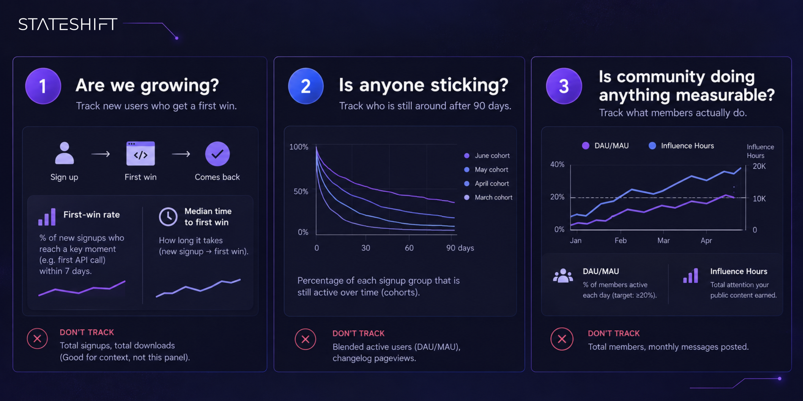
Three questions:
1. Are we growing? Measure how many new users reach their first real success with your product.
2. Is anyone sticking? Measure how many of each month’s new users are still using it weeks and months later.
3. Is community doing anything measurable? Measure what members actually do: attending events, downloading resources, reading content, showing up to office hours.
Those three questions hold up against an old test. Eric Ries wrote The Lean Startup back in 2011, and The Lean Startup Co. sums up his test this way: a useful metric is actionable, accessible, and auditable.
Ries also flagged the quiet cost of metrics that fail it. When nobody can tell what caused a number to move, people credit their own project for the wins and blame someone else’s work for the losses.
A dashboard like that doesn’t inform decisions. It starts fights in meeting rooms. So, one panel for each question. Let’s build them.
Panel 1: Are we growing? (Track new users who get a first win)
Signups and GitHub stars both feel like growth. In GitHub Stars Are Developer Instagram Likes, I made the case that a star is a vanity signal that rarely predicts adoption. Yes, I’m aware that a man who already wrote a whole post about stars is now lecturing you about stars again. Bear with me. A star costs a click and asks nothing of the person giving it.
It’s a bookmark, a vote on how good your README looked for ten seconds on a good afternoon. Nobody ships to production because they starred a repo.
Growth that matters is a new developer who does the thing your product exists for, then comes back for more. Call it a first win.
For a developer tool, that’s usually one specific moment. First successful API call. First deploy. Whatever your version is, it’s a single event you can count.
Postman argues that time to first call is the most important API metric. Postman describes measuring it, among other ways, as the time from a developer getting API credentials to making their first call.
Yes, that’s a vendor making a vendor’s case. The logic still travels: the moment credentials become a call is the moment interest becomes intent.
What the panel shows: two numbers. The first is your first-win rate: the percentage of new signups who reach that moment within a set window, say 7 days. The second is the median time it takes them to get there.
Metrics to avoid in this panel: total signups and total downloads. They can still feed the numbers behind the scenes, but neither belongs on this panel.
The number to watch is your own trend over time. If the first-win rate climbs the month after you cut a step from your setup flow, you’ve learned something real about your product.
Every company’s onboarding is different, so this month against last month teaches you the most.
Panel 2: Is anyone sticking? (Track who is still around after 90 days)
Here’s the number teams are most tempted to quietly swap out: retention.
Retention hurts to look at, so teams reach for warmer numbers. Weekly active users. Changelog pageviews. Those climb whenever you ship something, which feels like retention the way a sugar rush feels like a balanced diet.
Imagine a restaurant that counts everyone who walked through the door as a regular. Packed house every night, and the owner is baffled that the bank account says otherwise. (My restaurant analogies usually end with me hungry and slightly broke, so trust me on this one.)
Real retention follows groups of people over time. Take everyone who signed up in the same week (that group is a cohort) and ask how many are still using your product one week later, one month later, two months later and three months later.
The 90-day window matters because month one is the honeymoon. Months two and three are where a tool either becomes part of someone’s workflow or quietly stops getting opened.
What the panel shows: a chart that follows each signup group separately, showing the percentage still active at each point in time.
Here’s a hypothetical. Say 40% of the developers who signed up in March were still active at week eight, and 55% of the June signups were. Something you changed between March and June worked, and now you can go and find out what.
If every group sinks toward zero by week twelve, people are trying your product and leaving. No amount of marketing will fix that.
Metrics to avoid in this panel: blended “active users” figures, such as daily or monthly active users, that smoosh every group together. They mix new-user excitement with long-term commitment, which is exactly the distinction you’re trying to pull apart.
Panel 3: Is community doing anything measurable? (Track what members actually do)
This is where most DevTool dashboards dissolve into vibes.
The usual move is to chart community growth. Discord members. Newsletter subscribers. Those numbers rise because they have to, unless you’re actively banning people. That’s addition, and a first-year student could do it.
That graph is a guest list. You want to know who showed up and what they did once they got there: posting, attending events, downloading resources, viewing content, showing up to office hours.
The metric doing the heavy lifting here is DAU/MAU: the average number of members active on a given day, divided by the number active across the whole month. It’s a rough gauge of how often people come back. Yes, it sounds like a Wi-Fi password I’d forget within a minute. It’s still the most useful acronym on this page.
Our benchmark for a healthy community is a DAU/MAU of at least 20%, with “active” defined broadly: content views, downloads, event attendance and forum posts all count.
What the panel shows: one chart tracking two measurements, each recorded every week so you can see whether it’s rising or falling.
- The first measurement is DAU/MAU, shown as a percentage, with a reference mark at the 20% benchmark. Count a member as active on a given day if they did anything meaningful that day: posted or replied, viewed content, downloaded a resource, or attended an event.
- The second measurement is Influence Hours, which adds up how much attention your public content earned that week. For each piece, such as a conference talk or a LinkedIn post, multiply its impressions by the time people spent with it.
Then weight each piece by how intimate the format is, since a live talk builds more connection per minute than a post people scroll past, and add up the week. Our previous post on Influence Hours walks through the method.
Read the two together. Influence Hours rising while DAU/MAU stays flat means people are hearing about you and not showing up. The reverse means a small community is deeply engaged, and your reach is the thing to work on.
Metrics to avoid in this panel: total members and monthly messages posted. Anyone can inflate those with a giveaway or a caffeinated week of posting, and neither says much about your business.
Plenty of teams stare at their community numbers the way I stare into the fridge at midnight: lots of light, no answers. The 2024 State of Developer Relations report shows why this panel matters. Proving the business impact of DevRel jumped to the second-biggest developer-program challenge (28.5%, up from seventh in 2023). For the practice as a whole, proving impact with data is the top challenge (60.7%).
The field knows it needs this panel. Plenty of teams haven’t built it.
How can technical startups measure developer marketing without vanity metrics?
Short answer: refuse to give vanity metrics a panel in the first place. A vanity metric is a number that looks impressive and never changes a decision you make.
I’m not going to list all twenty candidates, because we’d be here until the heat death of the universe. Here are the big offenders, and why each one earns the label. I’m braced for the emails already.
Total signups. A signup is someone entering an email address once. It says nothing about whether they ever used the product, and plenty arrive from curiosity or a giveaway. If signups climb while your first-win rate sits still, you’ve paid for noise.
GitHub stars. Already roasted in Panel 1. A bookmark has no business on a founder’s dashboard.
Impressions. An impression means your content appeared on a screen, and that’s all it means. A post flashed at 50,000 people for half a second outranks a thirty-minute chat with the right senior engineer, and your dashboard should know better.
Newsletter signups. A subscriber list grows whenever you add a form or run a promotion, and it almost never shrinks fast enough to matter. It tells you how many people once gave you their email, and nothing about who actually reads it.
Social follower count. Following takes one tap and no commitment. Developers follow out of curiosity or politeness, then mute you. The number keeps rising even when your reputation is quietly sinking, which makes it a poor thermometer.
Community post volume. Message counts can be pushed to any number by a sufficiently caffeinated DevRel engineer, or by one chatty thread that runs to 400 replies. Volume says people are typing. It can’t say whether anyone got an answer or solved anything.
Documentation pageviews. A pageview means someone opened a page. They might have found the answer in ten seconds or bounced after a minute of confusion, and the count records both as a win. Instrument the task: did the developer finish what the docs were meant to help them do?
Response time in the forum. Fast replies are good news for the support team, and the community team should watch the number. A founder deciding where the business goes next gets almost nothing from it, so it belongs on a team dashboard.
The pattern across the list: each of these numbers describes activity. Outcomes only show up when someone gets a first win or comes back.
A dashboard full of activity is how teams convince themselves everything is fine right up until renewal season.
Why dashboards fail even when the metrics are right
Even with the right panels, a dashboard fails if nobody owns it. A dashboard with no owner is a houseplant in an empty office: technically alive, and nobody is watering it.
A TheyDo survey published in December 2024 found that half of business leaders feel overwhelmed by the data and dashboards they see each day. The typical leader monitors about five metrics for their department. More dashboards were never the answer.
A dashboard earns its keep when it works as a decision-making system. Every metric needs one named owner and one weekly update day.
My own rule of thumb: if a panel has no owner or goes stale, fix it or take it off. A stale dashboard is worse than having none, because it gives everyone permission to pretend they’re measuring something.
So here’s a test. Pick the first metric your eye lands on right now. Who owns it, and what decision has it changed in the last ninety days?
If the answers are “nobody” and “none,” you’ve built a graveyard of good intentions with a login screen.
What to do this week to fix your dashboard
You don’t need a new tool or a budget line for any of this. You need about a week and a willingness to delete things.
1. Monday: audit every panel. List everything on your current dashboard and write the last decision each panel changed. If you can’t name one, mark it for deletion. Expect to cut most of what’s there.
2. Tuesday: pick your first win. Decide the single moment that proves a new developer got value from your product, such as a first API call or a first deploy. Write it in one sentence and get your team to agree on it.
3. Wednesday: build the three panels with the data you already have. Start with a first-win rate and time-to-first-win for new signups. Add retention by signup week, tracked out to 90 days, and a weekly count of what community members actually do. Rough and ugly beats perfect and unbuilt.
4. Thursday: assign an owner and an update day to each panel. One person and one weekday per panel, written down where everyone can see it. If you can’t find an owner, the panel doesn’t deserve to exist.
5. Friday: archive the rest. Move the cut panels out of sight so nobody panics, and so you can resurrect one if a real decision needs it. Then book a 30-minute Monday review where each owner names one decision their panel informed.
Run that for a month and revisit. The panels that keep prompting decisions stay, and the ones nobody talks about go.
If you’d like a second pair of eyes first, we offer a free Blind Spot Call with me, a discovery call. Beforehand we review your website and product along with your current engagement, then flag blind spots (measurement gaps included) and hand back practical recommendations.
Three panels do the work. The rest just make you feel busy.
Common Questions On Building A DevTool Dashboard
What should a devtool dashboard track?
A devtool dashboard should answer three questions: are we growing, is anyone sticking, and is the community doing anything measurable. Stateshift recommends one panel for each. The first shows the share of new signups who reach a first win, such as a first API call or deploy, within 7 days, along with the median time it takes them to get there. The second shows retention by signup cohort, and the third shows how active community members are.
What metrics should you leave off a devtool dashboard?
Leave off vanity metrics, meaning numbers that look impressive but never change a decision. Common examples are total signups, GitHub stars, impressions, follower counts, newsletter signups, and community post volume. Each one measures activity, while a useful dashboard measures outcomes: developers getting a first win and coming back.
How should a devtool dashboard measure retention?
Track each signup cohort separately and show the percentage still active at one week, one month, two months, and three months. The 90-day window matters because the first month is the honeymoon period. Months two and three show whether the tool has become part of someone’s workflow. Avoid blended daily or monthly active user counts, because they mix new users with long-term ones.
What’s a good DAU/MAU benchmark for a developer community?
Stateshift’s benchmark for a healthy developer community is a DAU/MAU of at least 20%. DAU/MAU is the average number of members active on a given day divided by the number active across the month. Count a member as active if they did anything meaningful that day, such as posting, viewing content, downloading a resource, or attending an event.
Why do devtool dashboards fail even with the right metrics?
Usually because nobody owns them. Give each panel one named owner and one weekly update day, and remove any panel that goes stale or hasn’t changed a decision in the last 90 days. A stale dashboard is worse than none, because it lets the team believe it’s measuring progress when it isn’t.